The Survey Dashboard provides a consolidated view of survey performance metrics, enabling users to monitor feedback, response trends, overall performance, and program insights at a glance. It integrates ratings, participation data, key strengths, and areas for improvement into a single interface, supporting faster and more informed decision-making.
Default Filters
When the dashboard loads, the data is automatically displayed based on the following filters:
-
Date Range → Last 30 days (default).
-
Agent Name, Supervisor Name, Program Name, Tags, Channel, and Star Rating → All values included by default.
Users can adjust filters anytime to refine the data displayed.
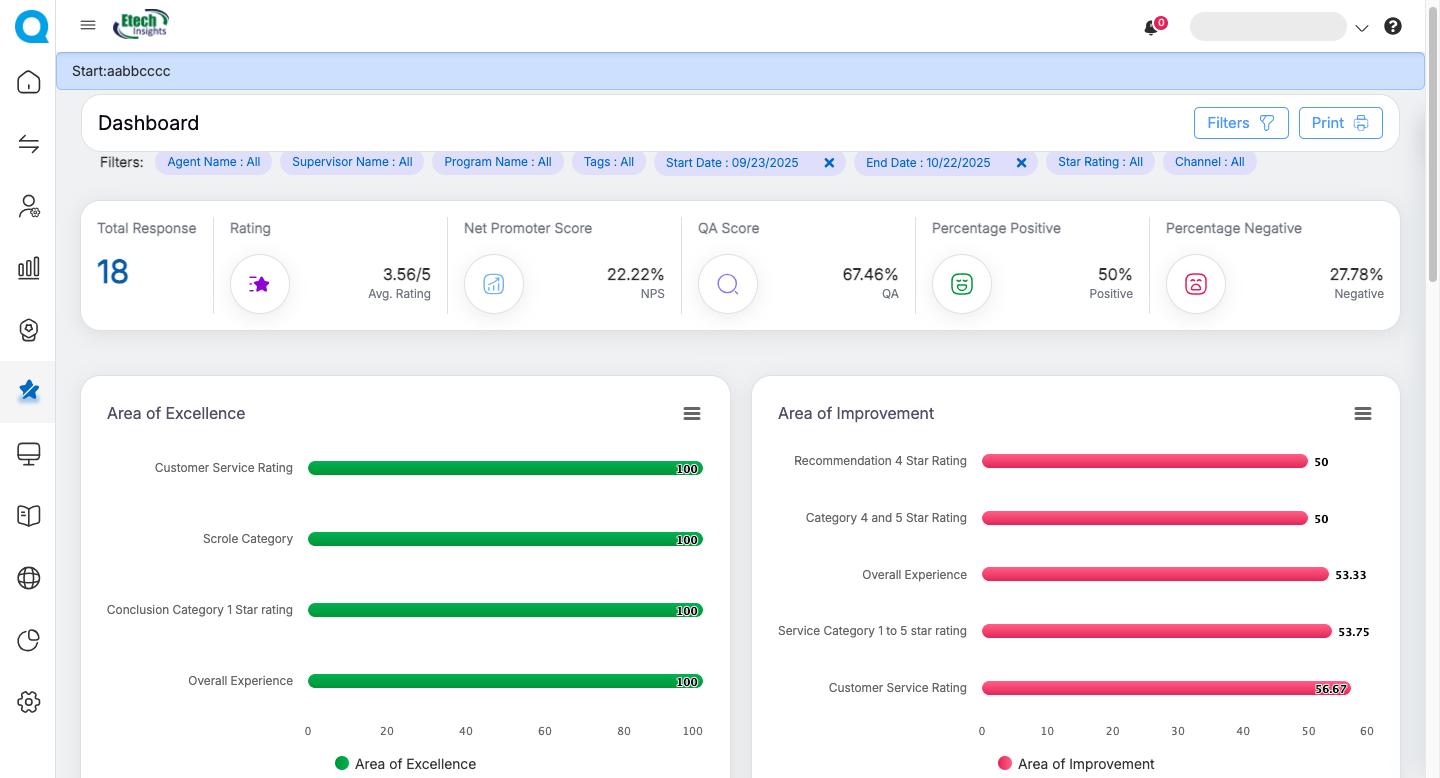
Key Metrics Displayed
At the top of the dashboard, a summary panel highlights the following metrics:
-
Total Responses → Count of survey responses received (e.g., 23).
-
Rating → Average rating across all responses (e.g., 2.87/5).
-
Net Promoter Score (NPS) → Overall promoter vs. detractor percentage (e.g., -4.35%).
-
QA Score → Average quality assurance score (e.g., 48.39%).
-
Percentage Positive → Share of positive feedback received (e.g., 34.78%).
-
Percentage Negative → Share of negative feedback received (e.g., 39.13%).
This top panel serves as a quick performance snapshot.
Charts and Visual Insights
-
Area of Excellence
-
Displays categories where agents/programs have excelled.
- These are represented with green progress bars (e.g., Overall Experience – 78.27) and indicate areas with or above 70% positive response.
-
-
Area of Improvement
-
Shows categories where performance needs improvement.
-
Represented with red progress bars (e.g., Financing option – 21.73).
-
-
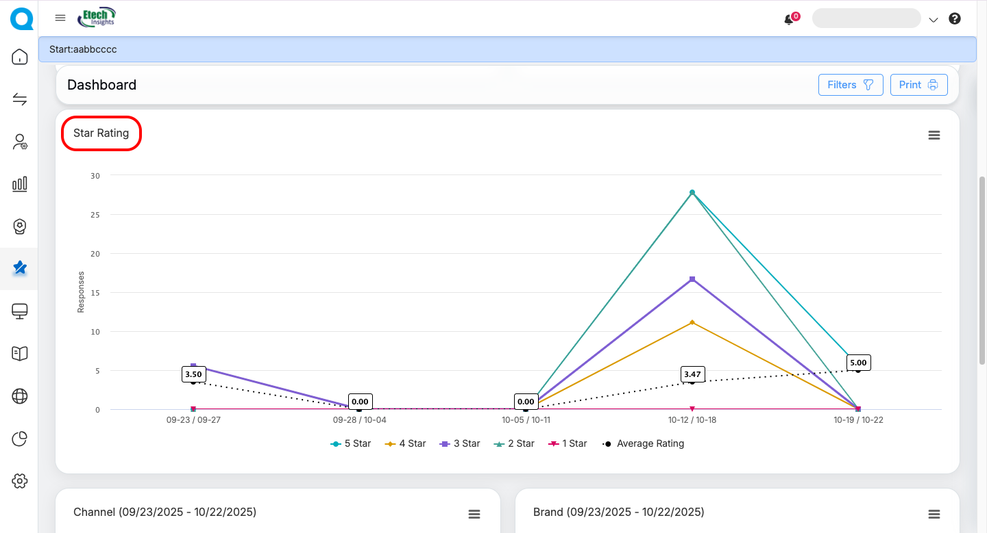
Star Rating vs. Responses Chart
-
Line graph showing the distribution of 1-star to 5-star ratings across the selected date range.
-
Includes the average rating trend line for quick performance tracking.
-
-
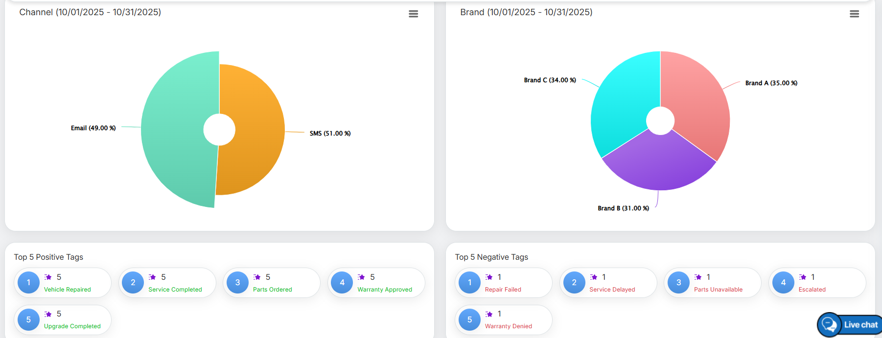
Channel Distribution
-
Pie chart displaying survey responses split by communication channel (e.g., Email 95.65%, SMS 4.35%).
-
-
Brand Distribution
-
Pie chart showing the proportion of survey responses per program/brand.
-
-
Top 5 Positive Tags
-
Highlights the most frequently occurring positive tags in responses.
-
-
Top 5 Negative Tags
-
Highlights the most frequently occurring negative tags in responses.
-
 Note : Click the three-line (hamburger) icon to view or download the graph/chart.
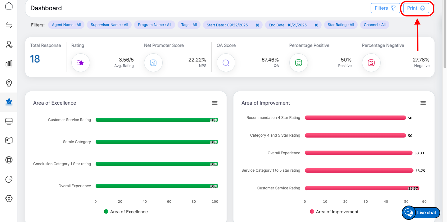
Print Button
Here in the Survey Dashboard, a Print option is available at the top right corner. Users can apply the desired filters and click this button to print the dashboard, including all displayed data, graphs, and statistical insights.
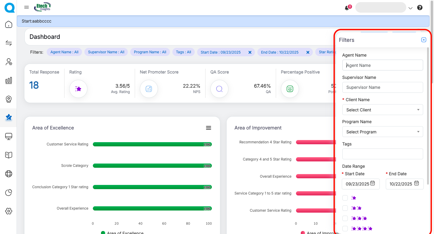
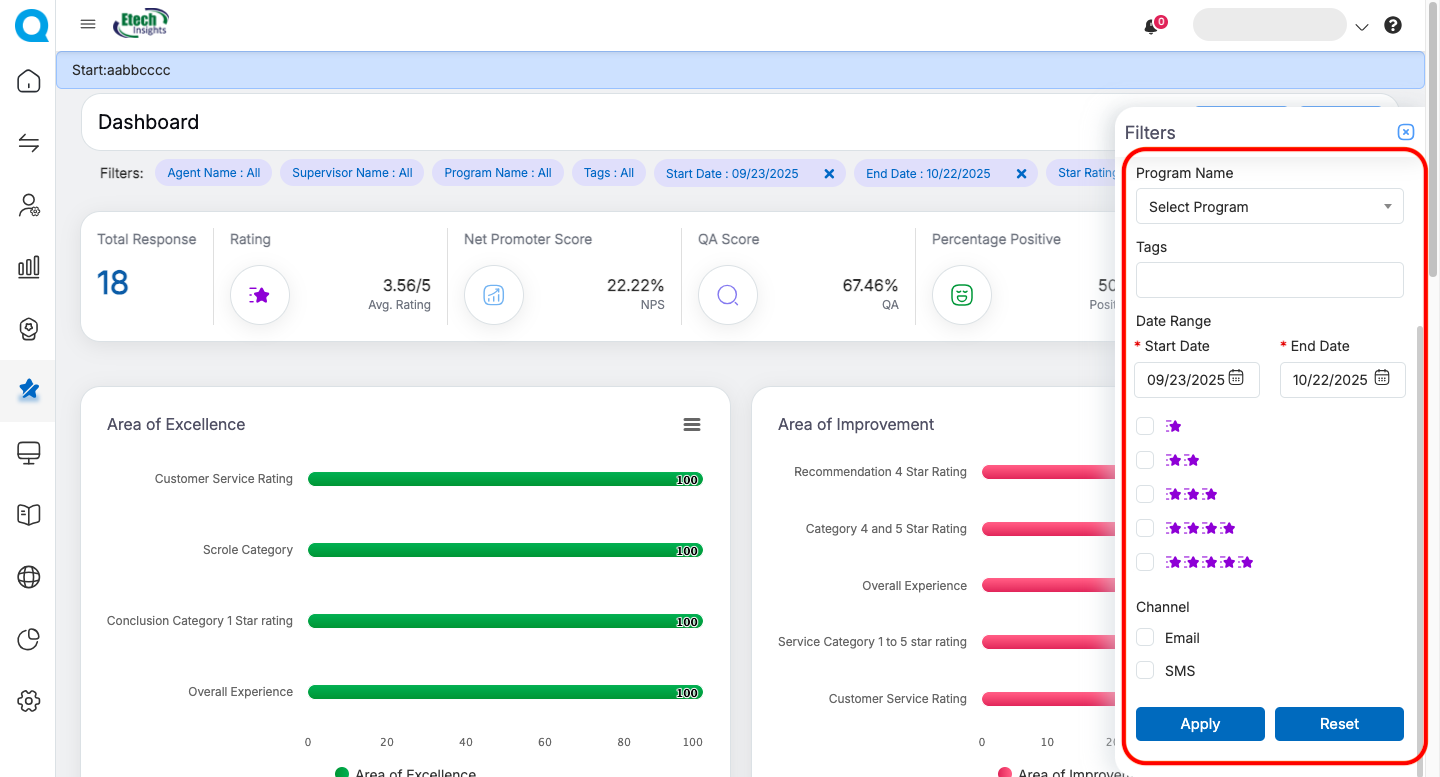
 Filters Panel
The Filters button on the top-right opens a panel where users can refine the dashboard data. Available filters include:
-
Agent Name
-
Supervisor Name
-
Client Name (mandatory)
-
Program Name
-
Tags
-
Date Range (Start Date – End Date)
-
Star Rating (1 to 5 stars)
-
Channel (Email / SMS)
After selecting filters, users can either:
-
Apply → Update the dashboard with filtered data.
-
Reset → Restore the dashboard to default settings (last 30 days, all values).
The Survey Dashboard serves as a powerful tool for tracking and analyzing feedback/responses in real time. By centralizing critical metrics such as average ratings, response rates, Net Promoter Score (NPS), QA performance, and sentiment distribution, it enables users to monitor both agent and program effectiveness at a glance. The visual insights through charts and graphs highlight areas of excellence and improvement, while breakdowns by channel, brand, and tags help identify performance patterns quickly. With customizable filters, users can drill down into specific datasets, ensuring precise analysis. Overall, the Survey Dashboard drives data-backed decision-making, promotes continuous improvement, and supports recognition of top-performing areas.
Video