The Survey Form Module in QEval enables users to create, design, manage, and distribute surveys across different clients and programs. It offers a centralized dashboard where all survey forms can be viewed, filtered, and maintained efficiently. From this section, users can quickly locate specific forms, apply filters by client or program, and take key actions such as editing, designing, configuring templates, or distributing surveys—ensuring a seamless end-to-end survey management experience.
Survey form
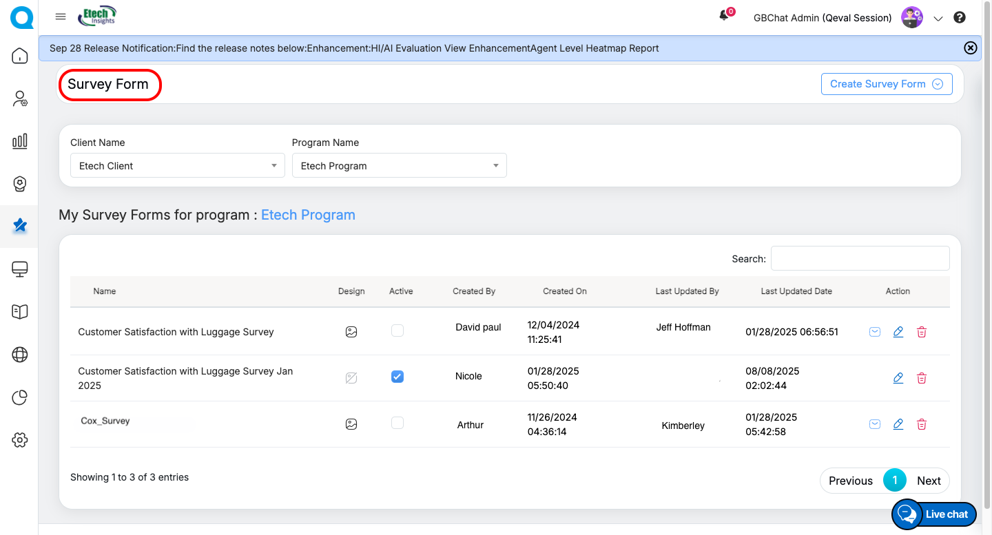
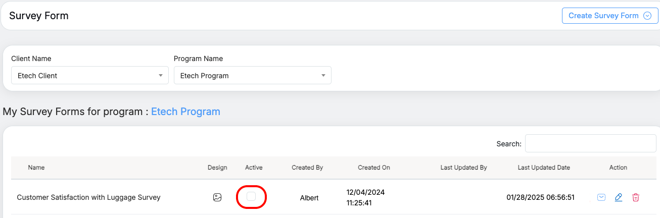
When you navigate to Survey → Survey Forms in the main menu, the Survey Forms Dashboard opens.
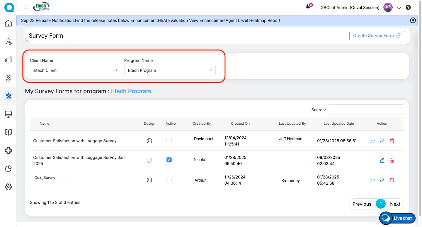
Filtering Surveys
To narrow down the list, you can filter survey forms by:
-
Client Name – Select the client from the dropdown.
-
Program Name – Choose the relevant program under that client.
Once applied, the dashboard updates to display only the survey forms associated with the selected client and program.
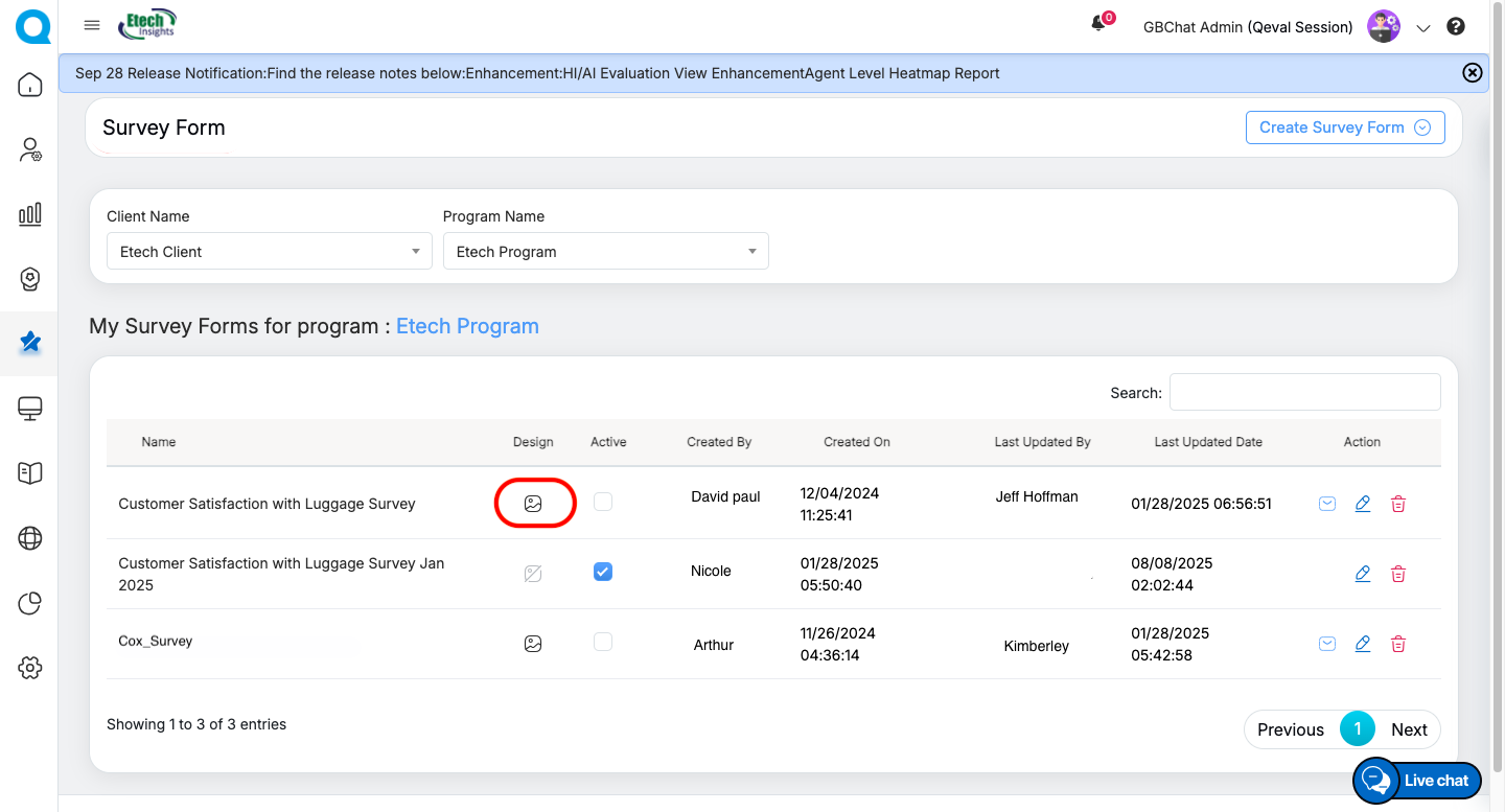
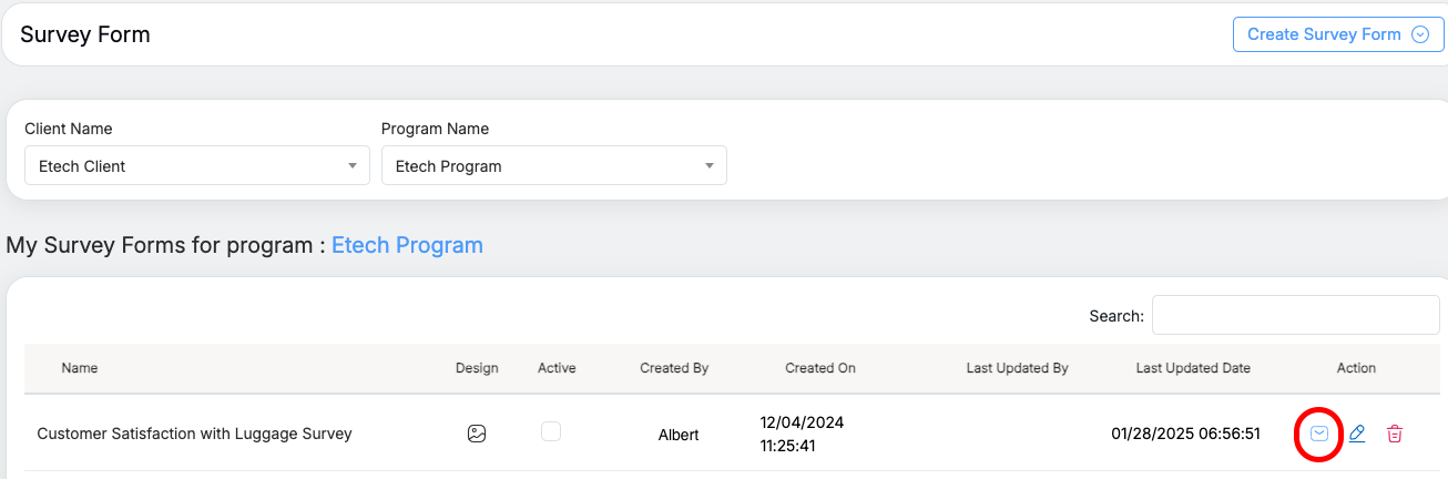
Survey Form Table
Filtered survey forms are displayed in a structured table containing key details:
-
Name – Title of the survey form.
-
Design – Provides quick access to open and edit the form design. Click to modify the form. If the form is active, this option will be disabled.
-
Active – Checkbox to activate or deactivate the form.
-
Created By / On – User and timestamp of when the form was created.
-
Last Updated By / Date – User and timestamp of the most recent update.
Note : Only one form can be active at a time.
-
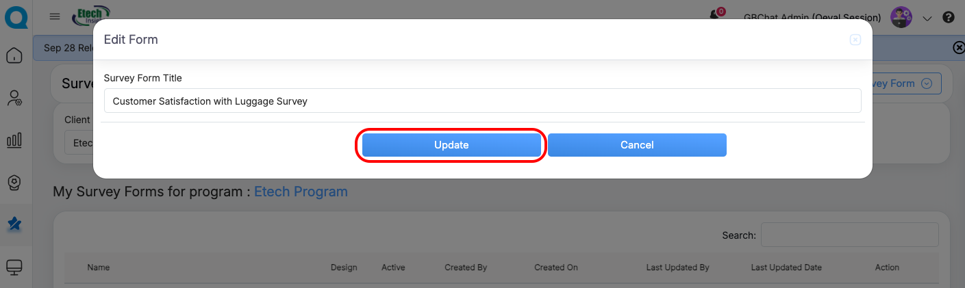
Action Buttons – Tools to manage the form:
-
Add/Edit Template – Configure email or SMS templates for distribution.
-
Edit – Change the name of the survey form.
-
Delete – Permanently remove the survey form.
-
This structured view ensures that users can seamlessly locate, manage, and act upon surveys for their clients and programs.
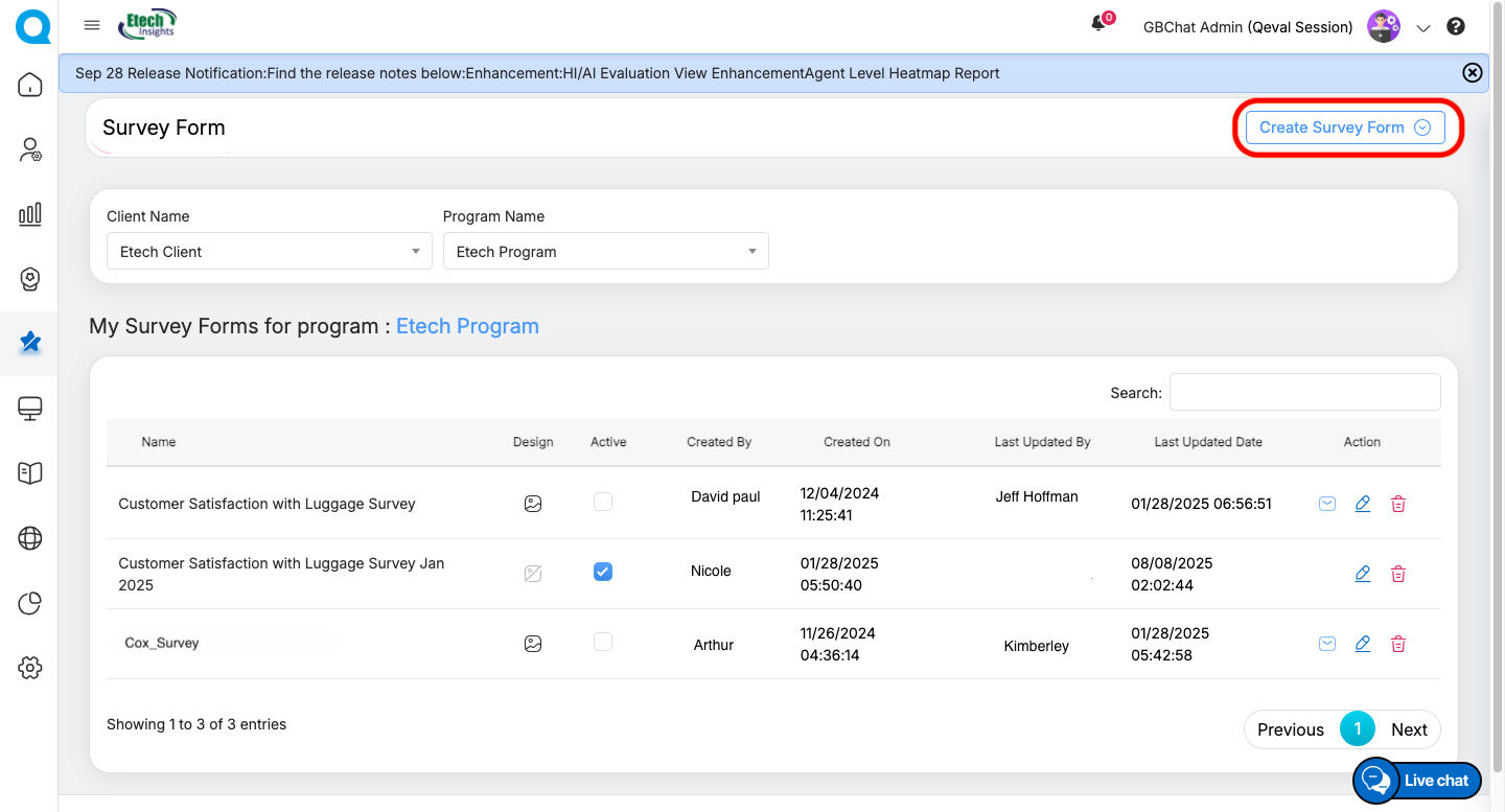
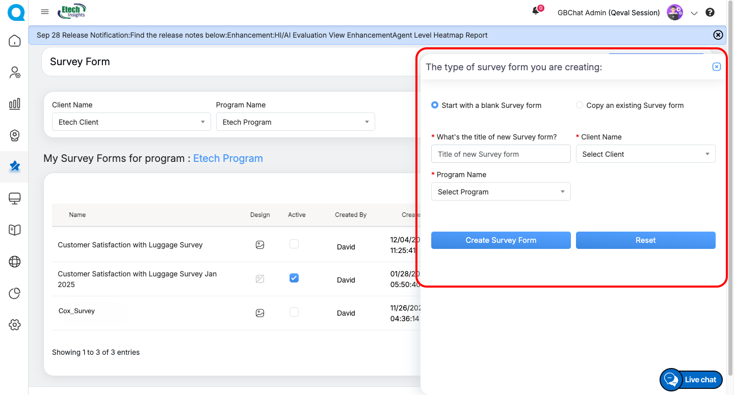
Creating a Survey Form
To create a new survey form, navigate to Create Survey Form. You will be presented with two options:
-
Start with a Blank Survey Form: Enter a suitable survey title, choose the client name and program name, and then click Create Survey Form to generate a new form from scratch.
-
Copy an Existing Survey Form: If you wish to reuse an existing setup, select the source client, program, and survey form name, then specify the target client and program where the copy should be created. Finally, click Copy Survey Form to duplicate the existing form.
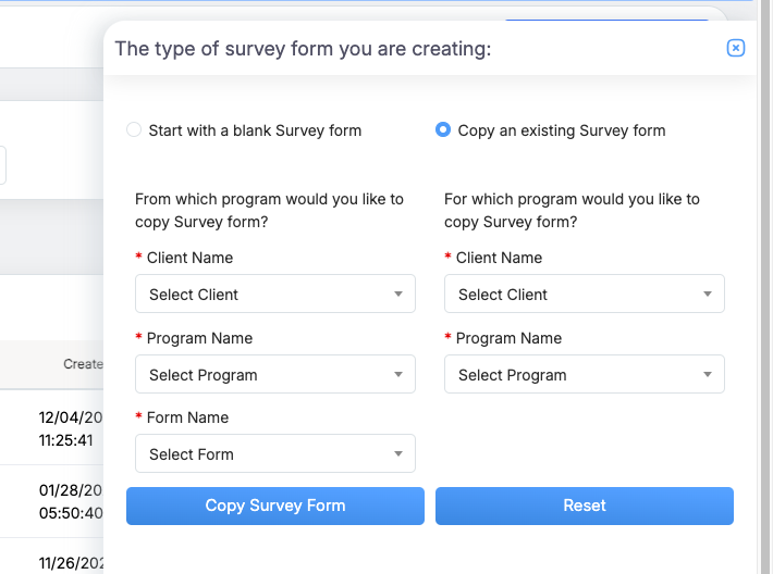
This flexibility allows users to either build customized surveys from scratch or save time by leveraging pre-existing templates.
Designing a Survey Form
Once a survey form is created, you can design it by adding categories, questions, and branding elements to ensure it aligns with your client or program requirements.
Navigation
To design a form, go to the Survey Forms table and click the Design icon for the desired survey.
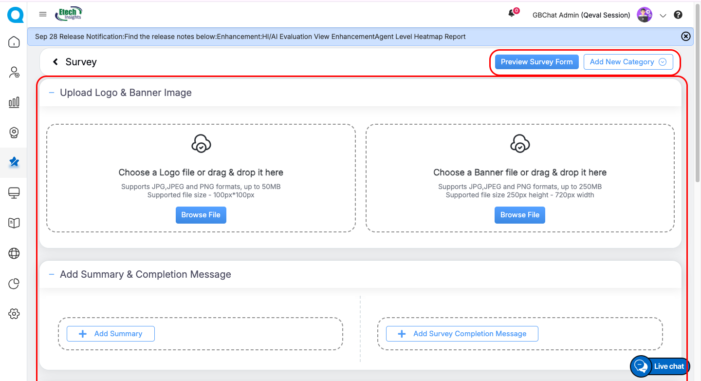
 Header Options
On the design page, you will find two key options in the header:
-
Preview Survey Form → View how the form will appear to end users.
-
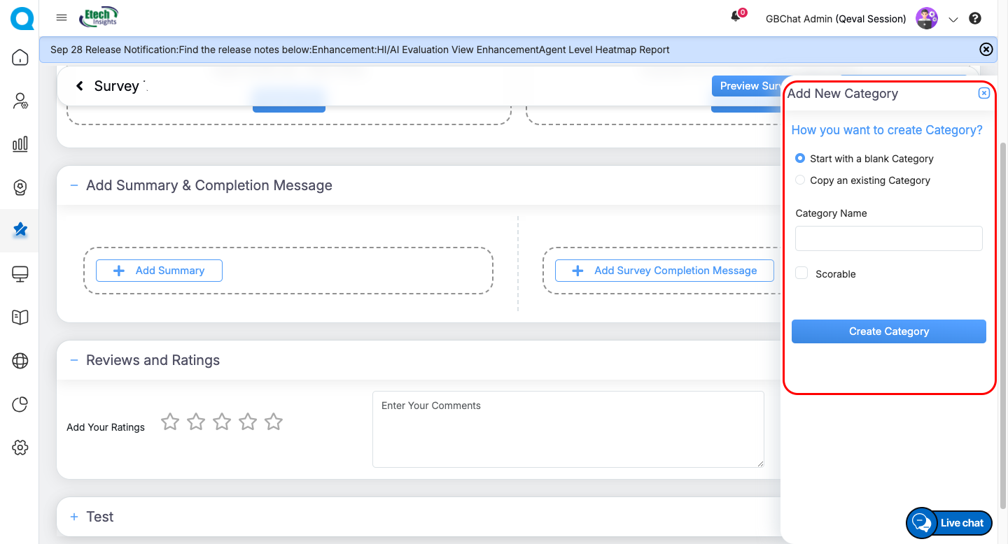
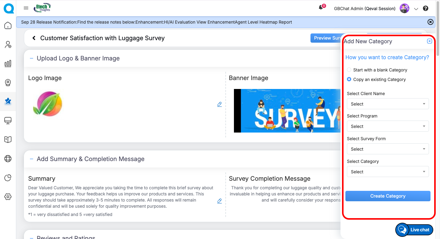
Add New Category → Insert a new section (category/tab) into the survey.
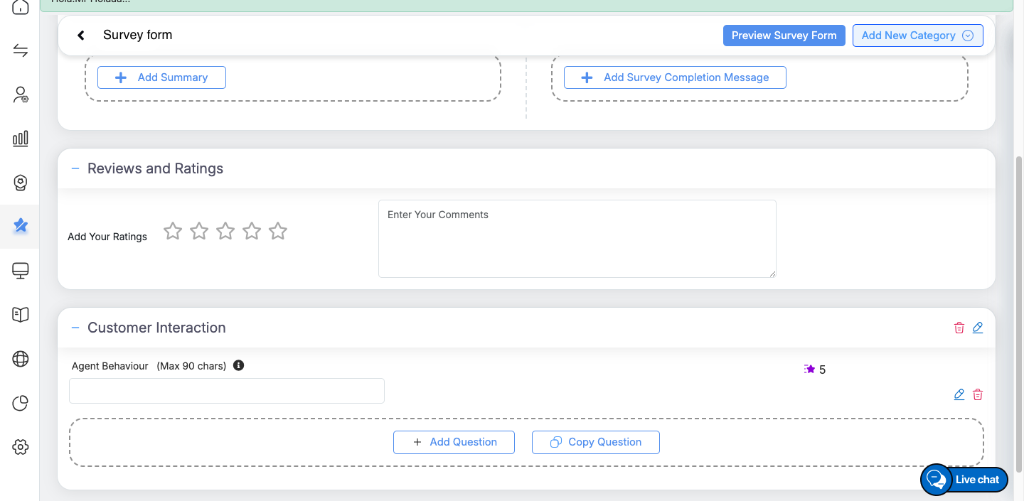
By default, some tabs such as Upload Logo & Banner Image, Add Summary & Completion Message, and Reviews & Ratings are available. You can also create additional categories to further structure your survey.
Default Sections in the Survey Design Form
Under the default tab, you can personalize the look of your survey:
-
Upload Logo & Banner Image → Add organization branding (supports JPG, JPEG, PNG). Click Browse Files to upload.
-
Add Summary → Provide introductory text or instructions displayed at the start of the survey.
-
Add Completion Message → Define a thank-you note shown after submission.
-
Reviews and Ratings → Provide a star-rating section where users can give ratings along with an optional comment box (up to 5000 characters) for additional feedback.
Add New Categories in a Survey Form
Categories help organize survey questions into sections. You can:
-
Start with a Blank Category: Enter a category name, select Mark as Scorable if needed, and click Create Category. This option lets you build a category from scratch. After creating it, you will need to add questions (or copy existing ones) as explained in the later section on adding questions.
-
Copy an Existing Category: This option allows you to reuse a category from another survey form instead of creating one from scratch. To do this, select the client, program, survey form, and category name from the available list. The selected category will then be copied and added as a new category in the current survey form.
Within each category, you can add or copy questions.
Adding Questions in the Survey Design Form
Users can include different types of questions, providing flexibility to collect diverse feedback and responses.
Steps to Add a Question
-
Click on + Add Question or Copy Question from the form builder.
-
Select the Question Type from the available options.
-
Configure the question settings, such as title, mandatory/optional, text length, and description.
-
Click Add Question to save it to your survey.
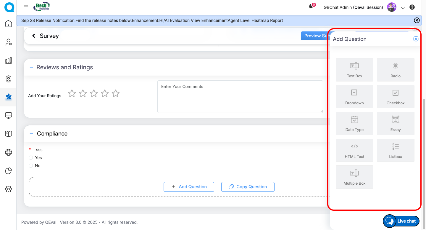
Available Question Types
-
-
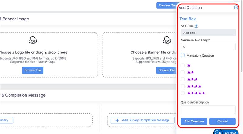
Text Box
-
Use the Text Box question type to capture short, open-ended responses.
-
Settings:
-
Title: Enter the question name (e.g., Agent Behaviour).
-
Max Text Length: Set character limit.
-
Mandatory: Mark if response is required.
-
Rating Stars: Choose 1–5 stars if rating is needed.
-
Question Description: Add brief guidance or notes.
Actions:
-
Add Question to save.
-
Cancel to discard.
-
-
-
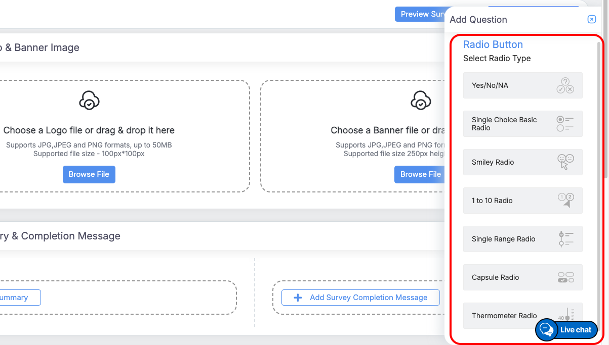
Radio Button
-
Select Radio Type
Choose the preferred display style for your radio question:
-
Yes/No/NA: Simple choice between predefined options.
-
Single Choice (Basic Radio): Standard circular buttons for single selection.
-
Smiley Radio: Emoji-based scale for visual feedback.
-
1 to 10 Radio: Numeric scale for rating or scoring responses.
-
Single Range Radio: Range-based option allowing one selection.
-
Capsule Radio: Capsule-shaped buttons for a clean, modern look.
-
Thermometer Radio: Visual thermometer-style scale to indicate intensity.
Example: Yes / No or Choose your preferred option.
-
-
Configuration Options
Fill in the requested input fields such as Title, Description, and other available options, then proceed with the selected Radio Type configuration.
-
Actions
-
Add Question: Save and apply your configuration.
-
Cancel: Discard changes.
-
-
-
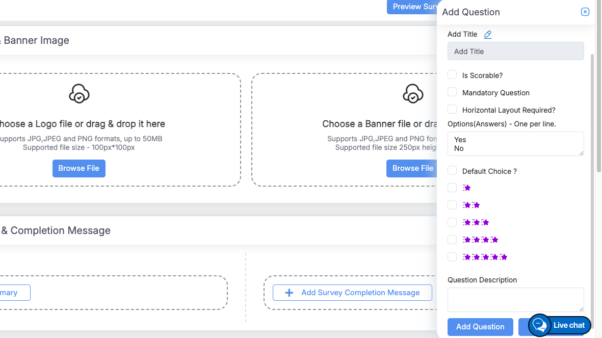
Dropdown
-
Use the Dropdown question type to allow respondents to select one option from a list displayed in a dropdown menu. This is ideal for structured responses and space-efficient layouts.
-
Configuration Options
-
Add Title:
Enter the question text (e.g., Select the agent’s department). -
Is Scorable?:
Enable scoring for responses if the question contributes to evaluation metrics. -
Mandatory Question:
Check this box to make the question required before submission. -
Horizontal Layout Required?:
Select this if you want the dropdown displayed in a horizontal alignment (optional). -
Options (Answers):
Add the selectable answers—enter one option per line (e.g., Yes, No, Maybe). -
Default Choice:
Define a pre-selected option if needed. -
Question Description:
Add a short note or guidance to clarify the question’s purpose.
-
- Actions
-
Add Question: Save your dropdown question.
-
Cancel: Discard any changes.
-
-
-
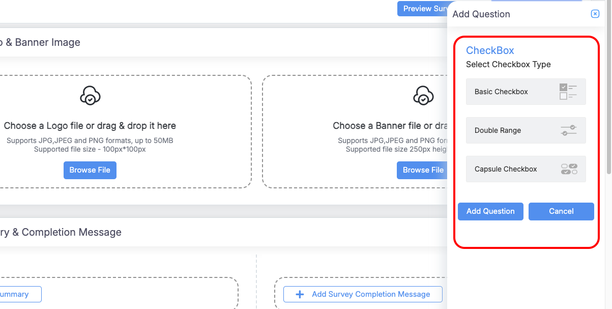
Checkbox
-
Use the Checkbox question type to allow respondents to select multiple options from a given list.
-
Select Checkbox Type
Choose the preferred display style for your checkbox question:
-
Basic Checkbox: Standard multi-select checkboxes.
-
Double Range: Dual-option range-based selection.
-
Capsule Checkbox: Capsule-style buttons for a clean, modern layout.
-
-
Configuration Options
Fill in the required input fields such as Title, Description, and other necessary details as applicable to your selected checkbox type.
Once all fields are completed, click Apply to configure the checkbox question. -
Actions
-
-
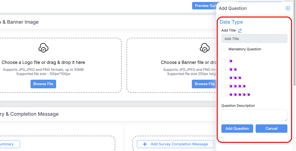
Date Type
-
Use the Date question type to capture date-based responses, such as feedback dates, or event timelines.
-
Configuration Options
-
Add Title:
Enter the question text (e.g., Select the date of interaction). -
Mandatory Question:
Check this box to make the date selection required before submission. -
Question Description:
Optionally, add supporting text or instructions for respondents (e.g., Use the calendar icon to pick a date).
-
-
-
-
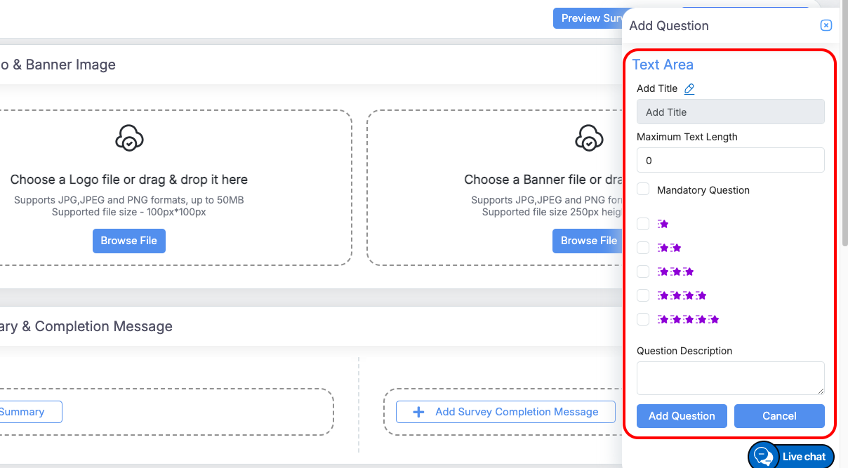
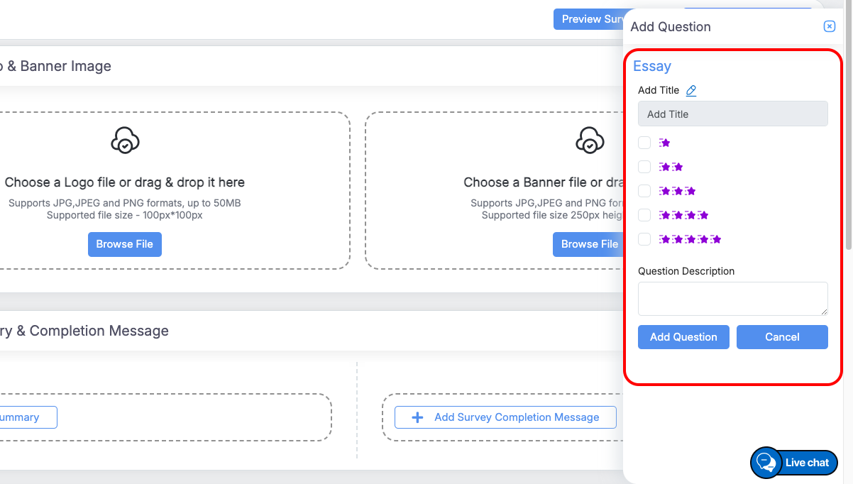
Essay
-
The Essay Question allows respondents to provide long, detailed, and descriptive answers in a text area. This question type is ideal for collecting qualitative feedback, opinions, or explanations.
- Configuration Options:
-
Title: Enter the question.
-
Maximum Text Length: Limit characters if needed.
-
Mandatory: Make the question required.
-
Description: Optional instructions or context.
-
-
Usage:
-
Respondents type answers in a text area.
-
Enforce length limits and mandatory responses as configured.
-
-
-
HTML Text
-
Allows respondents to enter formatted text using HTML. Suitable for rich text responses with styling, links, or embedded content.
-
Configuration Options:
-
Title: Enter the question text.
-
Question Description: Optional instructions or context for the respondent.
-
-
Usage:
-
Respondents can provide text with HTML formatting.
-
Useful for capturing detailed or styled responses in surveys.
-
-
-
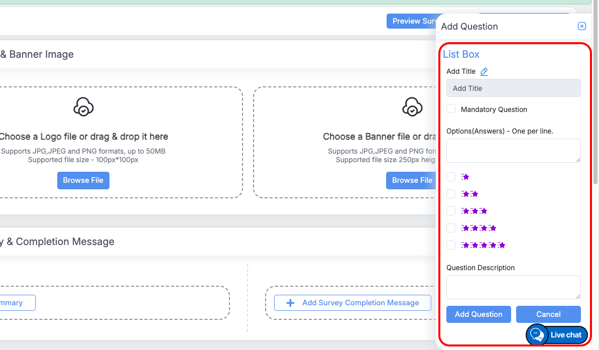
Listbox
-
Allows respondents to select one option from a predefined list.
-
Configuration Options:
-
Title: Enter the question text.
-
Mandatory: Make the question required.
-
Options (Answers): Enter each option on a new line.
-
Question Description: Optional instructions or context for the respondent.
-
-
Usage:
-
Respondents select one answer from the dropdown list as included in the Options(Answers) field.
-
Mandatory questions must be answered before submission.
-
-
-
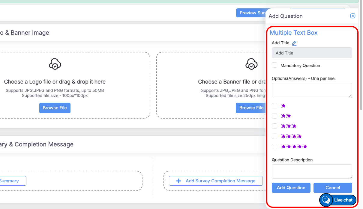
Multiple Box
-
Allows respondents to provide multiple short answers in separate text fields.
-
Configuration Options:
-
Title: Enter the question text.
-
Mandatory: Check to make the question required.
-
Options (Answers): Enter each label for the text boxes on a new line.
-
Question Description: Optional instructions or context for the respondent.
-
-
Usage:
-
Respondents fill in answers in individual text boxes corresponding to each option.
-
Mandatory questions must be answered before submission.
-
-
-
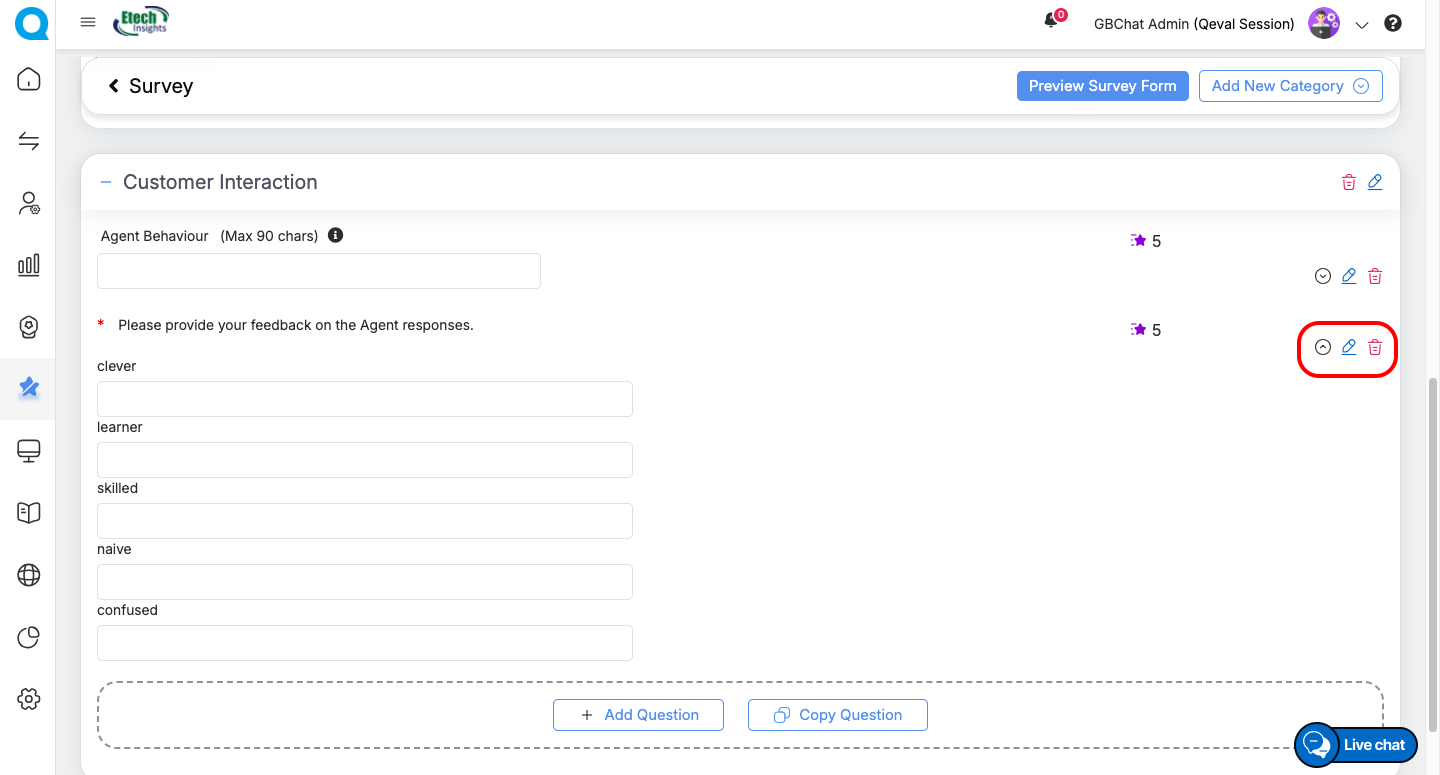
Quick Actions for Questions:
-
-
Edit → Modify the question text or type.
-
Delete → Remove the question permanently.
This flexible design process allows you to fully tailor surveys with structured sections, meaningful questions, and professional branding—ensuring a smooth experience for respondents and actionable insights for your team.
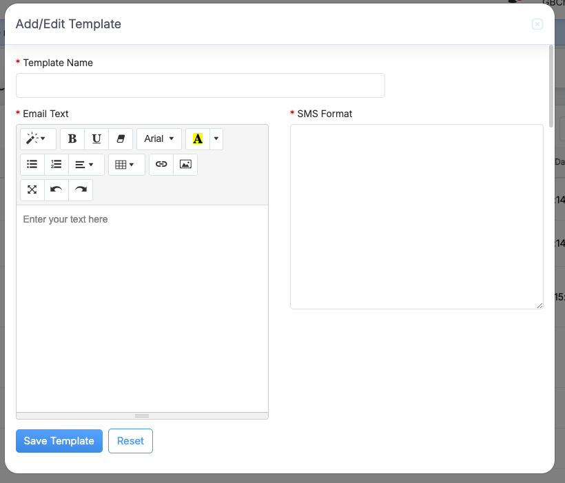
Configuring Templates
Templates define the format and content used to distribute surveys via Email or SMS.
Steps to Configure a Template
-
In the Survey Forms table, click Add/Edit Template under the Action column.
-
Enter the required details:
-
Template Name
-
Email Text (using the built-in rich-text editor)
-
SMS Format (plain text)
-
-
Click Save to finalize the template.
Key Elements while Publishing a Survey
- Preview the Survey to ensure it looks correct before publishing.
-
Activate the Survey Form using the Active checkbox. For each specifically selected client and program, only one form can be active at a time. While a form is active, the design option remains disabled and can only be modified when the form is inactive.
-
Use Configured Templates to distribute surveys via SMS or Email.
Summary
The Survey Form Module provides end-to-end survey management, allowing you to:
-
Filter surveys by Client and Program.
-
Create new survey forms (start fresh or copy an existing one).
-
Add categories, questions, and branding elements.
-
Configure templates for distribution via Email or SMS.
-
Activate, preview, and publish surveys seamlessly.
Video